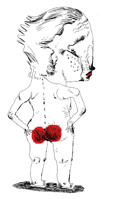
IF: Red

Poor boy!
I´ve been incredibly bored by my
recent way of drawing, so I approached it
differently today - more open, twitchy
lines, instead of the strict and controlled
lines I did recently. A bit more natural, so
to say. I don´t know. It was fun, though,
and it goes to show that restricting
yourself to one specific style will be
a dead end if done for too long.
I hope you enjoy the diversion.
And personally, I think
this could be more successful in the long run,
seeing how certain slick and vector-like
styles emerge in huge amounts recently;
I BET that after a couple of years people will hunger
for more hand-made looking, looser, emotional
work.
And by the way: There are styles
that are perfectly suited to be carried over
to digital ways of working. This is not one of them.
It REQUIRES paper and ink.
Illustration Friday is a perfect way to
test what people respond to, and I believe
that the emotional side is the most important
of all. Many people make sure to do shiny,
slick and technically flawless work, but if
one fails to carry over a certain expression,
then it misses the point. Not that it won´t
be able to sell, though.


12 comments:
Hahah.,....funny :) great work!
mmm interesting... I love the style!!
Love your line-work..and the blood red behind! [poor guy!!]
i like this a lot, the style is really nice. the concept is also highly enjoyable!
Great drawing! But I disagree that you NEED a paper and pen to get that result. I think Corel Painter does a great job provided you have a tablet. I use it for most of my drawings lately.
You took the words right out of my mouth this week Fred. It's like you went into my head, took what i was going to say(but never would, cause i'm too shy) and displayed it here for allll to read. Good job :)
You've given me some real good advice before.. and this post is just some real good advice again, that many people should pay attention to. Digital is good for somethings.. but pen and paper will always have more "emotion".
This "red" piece is a case in point. You can't achieve this "emotion" in Corel painter.. no matter how many un-do's you make.
Have a good week Fred.. I always look forward to hearing your wisdom.
Ariel
tablets make me barf on myself. i use them to kill robots.
i love this drawing, one of your best & most interesting in a while.
did someone get a spankin?
Hahahaha -- great drawing -- cheered up an otherwise bleak morning.
i wonder what happened. *hmmmmm....* ;P
that aside, i think the linework suits the intent. i suppose that's why your illustrations work well, because the lines convey the tone of the work. Do you plan a piece or do you make it up as you go with a rough idea in mind?
i think it is already happening, i see alot of handwritten typography and loose illustrations coming up in the design industry. Even if there are still a lot of slick artwork, i think humans, at the end of the day, still like things with a personal touch.
yes I agree more and more - I've tried the slick thing with illustrator and it just results (for me) in sterile stuff that might as well be clipart.
there are some interesting thoughts about it lately on this blog:
http://www.illustrationart.blogspot.com/
Frederik your style is too honest for digital lines. Though you can reproduce this style to an extent with a wacom, I think it is wrong headed for you to fake the funk. It is like using a drum machine in punk music.This automatic style is all about natural media. Also you are too young to be in a rut. Stick with your style.
Thanks, people. Nice to see you agree with me! I will try to insert some more random thoughts on this and that into my posts, aside from just pictures. So, like I always did. Or did I?
Post a Comment